Jump to content

stickyicky

New Members
  • Posts

    11
  • Joined

  • Last visited

Everything posted by stickyicky

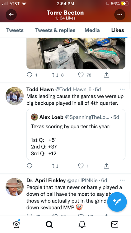
  1. found this in Torre Becton’s likes on Twitter. its now: Q1: +58 Q2: +34 Q3: +16 Q4: -24 he’s denying a very clear issue. Who gives a shit if the backups were in? We can’t play 4 quarters of football because are players literally incapable. guy has got to go.
  2. fucking hell bring Yancy back
  3. no o Line depth or conditioning = no play calling or scheme will save us from collapsing in the second half. defense played like shit at the end but that’s the result of being on the field way too damn much and an obviously shite conditioning regime program-wide.
  4. Casey is not spinning the ball right and we have no push in run game. qb coach sark sees that and does what
  5. there’s no other reason we will lose this game besides the OL. defense hasn’t been lights out but they’ve allowed only one TD. no room for bijan in between our wideouts. No time for Casey in the pocket, which actually doesn’t exist. Defense is getting gassed just like last week bc the offense gives them no rest. Everything goes back to the OL.
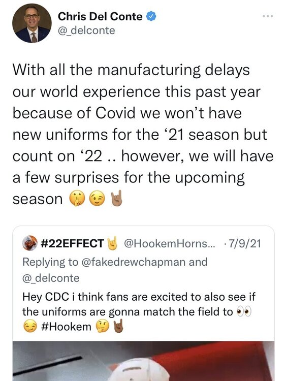
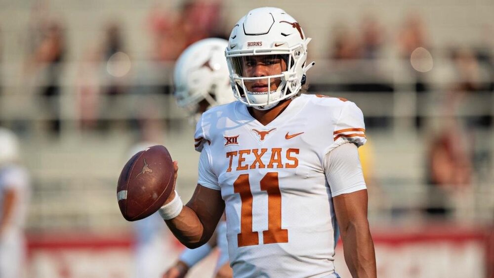
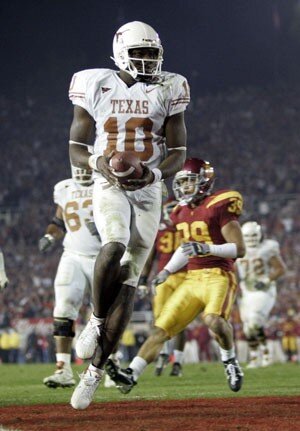
  6. I like that idea. as great as our stormtroopers are, the home jerseys are the iconic look which anyone can look at & say that's Texas without having to even see the logo or read the jersey. The away look features our signature color much less prominently, and personally I think the "TEXAS" on the chest looks great as well as making it more identifiable. the suits we brought out for Baylor last year were clean, we can all agree on that, but for week-in week-out play, I think we'd be better off with "TEXAS" on there for away games. I wasn't aware that there was already confirmation of new uni's. mind showing me where he said that?
  7. I tend to agree. although the pic I chose shows knee length socks, I think the black socks look best when they stay below the calf. at that point however the length is a player preference, and it might amount to a cleaner overall team look if we went with white socks and black cleats.
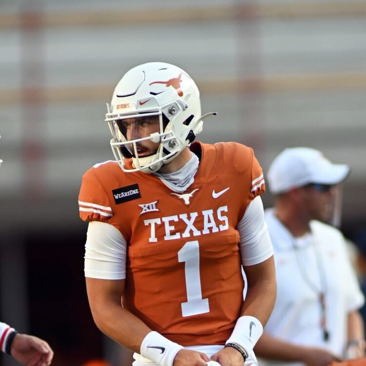
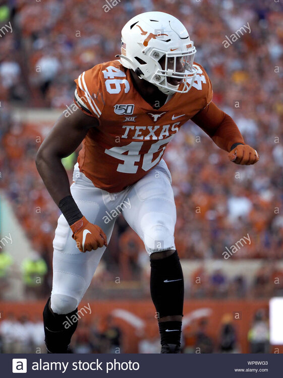
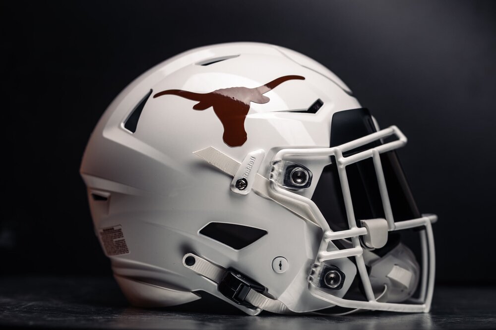
  8. First post here. Was thinking, when we join the SEC, it will be time to finally clean up our uniforms. We should have the best uniform in cfb given our iconic colors, logo, and history. But right now, we all know our look is far from its best iteration. Personally, I don’t know how we’ve excepted the cluttered mess that Nike gives us each year. Like seriously, why the hell did we not fix this shit yet: 1. replace b12 logo with dreadfully oversized sec counterpart. 2. Remove collar longhorn. Never had any reason to be there. Allows “TEXAS” script on chest to be moved up where it belongs. 3. Remove shoulder numbers. unnecessary and unreadable anyways. 4. Black cleats & socks at home, whites for stormtroopers only. I thought the change back to black last year looked great. It’s subtle and doesn’t clash with the burnt orange as it’s far enough away from the jersey. Just makes the team look saltier somehow: 5. burn the orange. don’t know what surly consensus is, but it’s clear to me we are at least a shade to bright right now. Especially since the material we use reflects poorly and gives and uneven look: compared to: this is what our helmets should look like for eternity: burnt.
×
×
  • Create New...